Thursday, October 17, 2013

Inspiration roundup

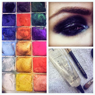
Lately, there's been a creative project that's been sucking up all my free time. Time I  used to use to maintain things like this blog. So, what better way to rejuvenate this blog than to share some of the things that have been keeping me inspired on that other project?

When I'm working on a new project, I like to compile lots of images and snippets that keep me inspired and motivated. I add to it as much as possible as I go along. When it's creative work for a client, I usually keep these images and inspirations to myself--often there's something very specific that I love about an  image but I know the client may see the big picture (which might be a poor fit for their goals). It's up to you if you share your inspiration with others or not.

When it comes to collecting inspiration, though, there is one "rule" I always like to keep in mind:


“If you steal from one author, it’s plagiarism; if you steal from many, it’s research.”— Wilson Mizner

 So, here's what's been inspiring me...


  (All images linked to source.)

Tuesday, May 7, 2013

Email marketing made easy

If you've been thinking you need to start using email marketing to get more clients, keep the clients you've got, and grow your audience... you're right! It is a fabulous way to keep in touch with people and to turn more of your prospects into clients. What's more, done right, email marketing can get you press coverage, help you leverage products for more passive income, and uncover hidden opportunities and markets you never knew existed.

Unfortunately, as much as there are advantages to email marketing, it's also really easy to find yourself stuck, confused and overwhelmed. There are so many choices, small and large, and so much work that needs to be done in order to get really great results from your email newsletter.

Perhaps you are finding yourself stuck getting started:
  • Choosing an email distribution provider
  • Choosing an email design
  • Choosing a name for your newsletter
  • Deciding how to describe your newsletter
  • Setting up the subscribe form
  • Importing your contacts
Or, you might have published one or two email messages only to find you're floundering for what's next. You might be feeling doubts or questions like:
  • Is anyone reading this thing?
  • Why is your open rate so low?
  • Why doesn't anyone ever give any feedback?
  • Why isn't anyone buying?
  • What should you write about?
  • Is your content boring?
  • Are you giving away too much? Too little?
  • How much do typos really matter?
  • Should you post your content on your blog? Give away your articles on article listing sites?
  • Why isn't anyone sharing the emails?
  • Why isn't your list growing?
  • Why did that person unsubscribe?
  • What should your list growth rate be? Your unsubscribe rate? Your open rate?
I wish I could answer all your questions and doubts in one long blog post. But I can't. Because the truth of the matter is, without talking with you first, I don't know the answers to any of these questions. Without knowing more about you, your email marketing goals, your list, your audience, and what you've been doing, my best answer is, "It depends..." or, "Statistically, I see a lot of..."

But there's still good news! See, I've been helping people just like you get bigger, better results from their email marketing for well over a decade. And I can help you too. All you have to do is request a consult and I'll be happy to answer your questions, give you guidance and insight, or even set the whole thing up for you.

Email marketing can be easy. Honest. Especially if you get help.

Friday, April 26, 2013

Email design that readers love

Would you like an email design that your readers love? Make sure to take these five elements under consideration.
  1. The nameplate. The newsletter nameplate is where you display the newsletter's name. It usually appears across the top of the newsletter (though it doesn't have to) and it's usually designed in a way that's in keeping with your style. (In other words, if your emails are professional, the nameplate would be too, if your emails are friendly, the nameplate would be friendly in style.)

    Advanced Advice: Remember, some of your readers will be reading with images disabled which means they won't see your nameplate at first glance. So, make sure to give that image a name that's really intriguing so that readers will click "Display images" and be able to see all the images in your newsletter.
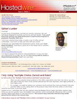
  2. See the way this email design handles the table of contents
  3. The table of contents. In emails, having a table of contents is a great way to keep readers reading all the way to the end. Make sure your TOC appears at the top of the email so that it's "above the fold" for best results.

    Advanced Advice: Don't just copy / paste your headlines into the table of contents. Rather, think about ways to describe your content that are pithy and intriguing. Sometimes your headlines will be too long to make the maximum impact in your table of contents. So, think of the rules you follow for email subject lines when writing your TOC--keep it short, keep it interesting, and omit any unnecessary words.
  4. Use personal photos. Statistically, most readers read emails with images turned off. So, you want to get a reputation for including really fantastic, relevant, original images in your emails--that way, readers will click to display those images each time you send a newsletter.

    Advanced Advice: Label photos clearly in a way that makes them sound intriguing. Don't use misleading labels (that's the sort of thing that only works once or twice and then people start ignoring your labels), but do make your images sound as interesting as possible.
  5. Use consistent colors. You might be tempted to shake things up by altering your layout or your color scheme every time you send an email newsletter. Don't! You'll get the best results from your email marketing by being consistent and memorable. Sticking with the same colors means people will recognize your email design and start to feel more comfortable with you.

    Advanced Advice: Choose great colors! Don't go with "safe" colors or copy your competition's color scheme--rather use colors that you love, that are a great match for your content and your audience and use them in the right proportions. If your style is more professional and low key, you can still use a vibrant color like orange, but you'll want to use it in smaller doses than if your style is loud and dynamic.
  6. Bring in some inconsistency. Too much sameness is boring! So, shake things up by using new photos and images each time you publish. It's important that there's enough similarity from issue to issue that your readers recognize your email design, but people pay attention to what stands out and different is what stands out.

    Advanced Advice: Taking a new headshot of yourself each time you publish can make your email marketing vibrant and different while still giving you plenty of consistency.

Tuesday, March 12, 2013

You need to know how to write a sales letter

I know, we usually talk about design around these parts. Today, though, we're going to talk about what you fill it with--your text.


See, you can have something really gorgeous, but if the words you put in it aren't good, your design won't be able to do its job. Which will make your design sad, not happy ;-).

It seems like writing content should be easy. After all, we all learn to write in school. "Reading, writing and 'rithmetic," as the rhyme goes. But, alas, it's not so simple.

In the first place, the way they teach kids to write and the way one goes about writing really killer content are totally different. It gets even more complicated when you're writing a sales page because then your words really start to matter.

So, how do you go about learning how to write a sales letter? Start with these three tips.

  1. Consider your audience. One of the biggest mistakes you could make is to just dive into your writing. Even if you write great content, it might be all wrong for your audience. It all starts with who'll be reading what you write so never, ever skip this step.

    So, who are you writing to? Are they old or young? What matters to them? Why are they interested (or not interested) in what you're writing? What are their priorities? What might distract them from reading your content? How can you keep their attention? The more you can really know your audience, the better you'll be able to make sure your sales letter or content speaks to them.
  2. Consider your goal. What's the one thing you want a reader to do? Contact you? Buy something? Sign up for something? Whether you're writing a sales letter, or you're writing an About page (or something else entirely), every page you write should have one singular goal and you want to choose it before you start writing.

    Remember, you only want to have one goal per page. It's tempting to have lots of goals, but the fact is, people are too easily distracted for that. So, focus on just one goal per page, even if that goal is to "get them to click to the next page."
  3. Revise like crazy. Sure, there are some writers who brag about getting it right the first time. (Some of them do, most of them are delusional.) But, unless you're a professional with a team of editors trailing behind you, you're going to need to revise. There's a reason Joyce Carol Oates said, "The pleasure is the rewriting" after all.

    Revising your letter or content is the only way to truly improve it, so don't skimp on this step. And remember, revising isn't the same thing as proofreading. Proofreading should be the last step, and it helps make sure your copy is error-free. Revising is all about making sure your words are in the right order.
Sure, writing really great content is about a lot more than just these three things, but you'll be surprised how far these tips will get you--they give you great bang for your buck.


Thursday, February 21, 2013

Email list growth: Purge to grow

Want to grow your newsletter list? Cut some of your subscribers.

I know, it sounds dangerous. Ruthless, even. And that's exactly what it is. But list growth demands you take the path that works, not the path that's easiest.

See, when you publish an ezine, you're automatically competing with all the other emails people are getting--which is usually a lot! Which means you absolutely must do things to a high level of excellence.

In order to maintain that high level of excellence, it's important that you take full control of who's on your list. Why? Because if you let people on your list who don't belong, you'll wind up confused, befuddled, and bored.

See, people on your list who don't belong on your list won't complain about the stuff you need them to complain about. Which means you might not have the honest perspective necessary to know when you've veered off course. Plus, people who shouldn't be on  your list will complain about stuff you don't need them to complain about.

For instance, if your list is mostly made up of  your competition, chances are good, when you launch a product you may get oodles of complaints. That doesn't mean that your Tribe doesn't want you to launch a product. It means your competition doesn't want you to launch a product. See how this could be a problem?

But it's usually not so blatant. Usually, what happens is slowly, bit by bit, the readers who aren't quite right for you wind up eroding your message. You contort yourself to explain yourself to them. You jump through hoops to entertain them. You worry over whether you might offend them.

All of this saps the power from your email design. And, ultimately, you wind up off course, with readers who don't really care much whether they hear from you or not. But, hey, you have a large list.

The alternative is to Be Ruthless and do what it takes to shape your list. Yes, let it grow, but prune it along the way. Tend to it so that it grows strong and beautiful. Your list will grow more slowly, but it's worth it.

Thursday, February 7, 2013

Coding email design that doesn't break

Today we're going to talk about the fundamentals of coding email design. See, it's not as easy as you might think. The reason for that is that when it comes to displaying html email, email readers are stuck in 1995. They simply don't let you use the latest and greatest coding. So, what does this mean?

  1. Use tables instead of divs. For all of your layout coding, use a table instead of a div. It can be a bit annoying if you code websites too, but this one tip alone will save you hours of agony when you discover that your divs went all haywire in someone's Outlook inbox.
  2. Send multipart MIME. What's this? Basically, it means sending both the HTML code and the plain text version of your email all in one message. The reason to do it this way is two-fold: first, it'll reduce your spam score (which you want--the lower your spam score, the more likely your email is to be delivered) and second, for readers who can't read the HTML version, your email message will still display which means they'll still be able to read it (and won't send you angry emails about sending them blank or buggy messages).
  3. Keep it simple. Because email programs aren't as advanced as web browsers, it behooves you to keep your code simple. That means staying far from things like javascript and HTML5, but it also means using as few images as possible and keeping the design as simple as possible. All of this is a good idea because it means your email is less likely to break, and it also means it's more likely to display nicely for a wide variety of readers--whether they're reading on a mobile device or tablet or on an enormous monitor with images turned off.
  4. Code semantically perfect code. Errors in HTML code are really common (over 97% of HTML emails have errors!) AND they're also a trigger for most spam filters. So, make sure your code is error-free. There are lots of tools out there that you can use check your code, I like Markup Validation Service from W3C.
  5. Code by hand. It's crucial that your email file size be as small as possible (this avoids errors, avoids raising your spam filter score, and helps your email load faster on slow connections). The only way to make this happen is to code by hand so that you can avoid all extraneous code. I use Notepad, personally, but any plain text editor will work. If you don't know how to code HTML, you shouldn't be designing email newsletters.
  6. Test your email! Test your email in as many different email programs as you can. This helps you spot any display errors long before they arrive in readers inboxes. Faulty display is a leading cause of unsubscribes or passive opting out (when the reader simply stops opening your emails) and this kind of attention erosion costs companies big. It's well worth the half hour or so it takes to check out your email across multiple programs and platforms.
By the way, if all of this sounds like way too much work, bring in an expert. We'd be happy to help by creating your email design for you.


Monday, January 21, 2013

Email that gets read

If you publish an email newsletter, that's awesome! Now comes the hard  part. See, it's not enough to just do the work of publishing--the template design, the writing, the sending, the sticking to a consistent schedule...

Nope, you've also gotta get that message read! If you don't, then all the time you invest is for naught, and that's just plain frustrating. How do you get that message read? Today I've got three tips to share with you:


  1. A name (that's consistent) in the from field. Many small businesses make the mistake of sending their email newsletter "from" the company. Don't do that. We don't read email from companies, we read email from people. Now, obviously, for big businesses this is different, but for companies with fewer than 50 employees, you're almost always best off sending the email from one specific person and using the same person every time.

    (By the way, there are tools out there that let you send a newsletter from multiple company contacts. So, let's say you have three account managers--you can have the newsletter sent by each of those account managers to his/her contacts. So, Client A who deals with Account Manager A would get the newsletter from Account Manager A. This can be a great way to build relationships and to make sure your readers recognize the name in their inbox.)
  2. A subject line that looks good. When thinking up subject lines, obviously they need to be compelling--they've got to get people wanting to open up right away. But, also consider how the subject line will actually *look*. I know that sounds pedantic, but the truth is people see how something looks before they read the words you've used. So, if your subject line is looooong, that's what they notice before they see that you've used a dozen delicious words. Or, if your subject line includes words that look like other words at a quick glance, the reader might just mistake your newsletter for something else.

    (Remember, they're skimming their message list fast! Keep it simple in the subject line.)
  3. Email design that doesn't make heavy use of images. Once someone's opened your message, they won't read it if it looks all blank (the way it will if your message is all images and the reader doesn't have images turned on for your messages). Rather than relying too heavily on images, use other design tricks to make the newsletter look interesting and engaging--consider any photos or illustrations to be seasonings rather than the whole main course.

    (There are ways to increase the number of readers who are opening your images, but even if the majority of your readers view your email design with images turned on, you'll usually want to communicate the most important parts of your message without them.)
By using these three guidelines, you can get more of your readers to read your newsletter, ensuring that the time you spend putting together each issue won't go to waste.